Best automotive website design: tips, ideas, mistakes and examples
 In this article, Hedges & Company looks at the best automotive website design. We show automotive website design best practices, design tips, and mistakes to avoid with your own website.
Hedges & Company even created a few website examples for you. To do this, we grabbed screenshots of well-designed websites from other industries, then we edited them to turn them into automotive parts and accessories websites (scroll down).
This article focuses on home page web design. We’ll leave the product detail page (PDP) web design for another time.
The author, Jon Hedges, has 40 years of marketing experience in the automotive aftermarket industry.
Click for LinkedIn profile ![]()
eCommerce website design tips for automotive sites
First and foremost, you want your home page to convey trust in your business, show a visitor what you do or sell, and entice them to browse and ultimately make a conversion. A conversion can be purchasing an item, creating a lead if your site is for lead generation, a phone call, or whatever you define as a conversion.
Design tip #1: Make a good impression on your website visitors quickly
You have to make a good impression in a very short amount of time. That’s because research has shown web visitors can judge a website’s visual appeal in just 1/20th of a second!
So our first tip is to really plan your home page. To do this, make your home page clean, uncluttered, and make sure it loads quickly.
Design tip #2: On a website, mobile comes first
You need to make a good impression quickly, but it has to happen on a mobile device. If you have a parts and accessories website, 70% to 80% or more of your visitors will be on a mobile device. So many of us are on our desktop computers all day running a business, so we forget to think about what the customer sees. If your website doesn’t render well on a mobile device, put that on your to-do list.
Design tip #3: Eliminate distractions on your website
Too many website home pages have rotating banners or slide shows, and animations. That creates at least three problems:
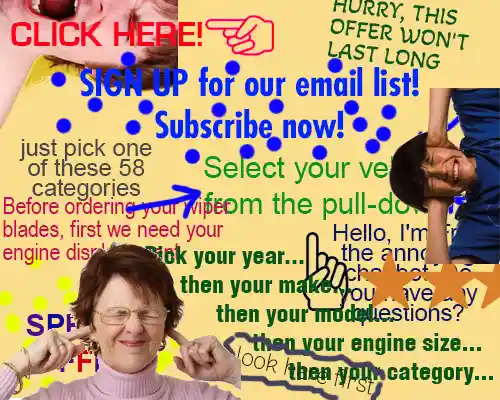
For best automotive website design eliminate distractions on your website!
The first problem is that animation and rotating images get ignored by shoppers. Many studies have shown that shoppers just don’t pay much attention to them. Hedges & Company has verified this by analyzing clicks from home page slideshows and by recording user interactions. This is called “banner blindness.” Many times, these carousel slide shows are very large, so they can take up too much page space without an apparent benefit.
We look at home page designs, below, that don’t use slideshows at all.
The second problem is that too many distractions, buttons, and links confuse shoppers. This is where something called Hick’s Law comes into play. In the 1950s, the psychologist team of William Edmund Hick and Ray Hyman discovered that if a consumer had too many choices, it took a longer time to make a decision. You don’t want a bunch of links, rotating images, and menus slowing down a shopper; you want the shopper to start shopping as quickly as possible.
We look at home page designs below that keep distractions to a minimum.
The great horror film director, author, and direct marketing guru (how’s that for a career combination?) Herschell Gordon Lewis came up with a formula for this in the 1980s: E2=0. That stands for “when you emphasize everything, you emphasize nothing.”
The third problem is that rotating images and animations require more files and code to work. This means your home page will take longer to load.
Design tip #4: Use at least one call to action (CTA) on your home page
A call to action is important. It asks your visitor to do something and helps guide them into your website. Links to popular products or categories, or encouraging visitors to “shop now,” get consumers interacting with your site more quickly. A CTA can be a button to “shop now,” a link to see products on sale, a phone icon for click-to-call, and so on.
Examples of the best eCommerce website designs for automotive sites
Here are examples of a few websites that combine clean design, calls to action, and keep distractions to a minimum. We then turn these websites into an automotive website. We did this to show you what a clean parts and accessories website could look like, as well as to give you (or your web designer) ideas.
Good website design example #1: McMaster-Carr
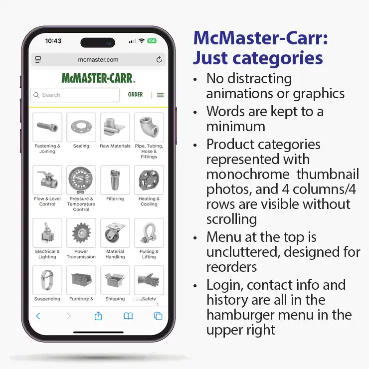
A good example of best automotive website design: Nothing fancy. Click to make larger.
McMaster-Carr’s website is, well, it’s boring. But it gets the job done. In this case, boring puts money in the bank.
McMaster-Carr sells a lot of boring things (boring, unless you’re an engineer?). Its home page cuts to the chase: Small, monochrome images that represent major categories.
There are no animations, no rotating slide shows, and no unnecessary words. They may be the “Rock Auto” of maintenance supplies, tools, and hardware.
You can see four rows and four columns of product categories without having to scroll down on a phone.
All the important stuff, like links to login, to create an account, order history, hours, and address, is all in the hamburger menu in the upper right corner. (A “hamburger” menu is what you call the three horizontal lines.)
McMaster-Carr turned into an automotive website
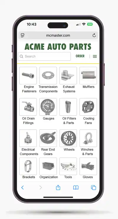
McMaster-Carr reimagined as an auto parts website. Click to enlarge.
Here is what the McMaster-Carr design could look like, if it were an automotive website for “Acme Auto Parts.”
We turned some of the categories into auto parts categories.
(Don’t look too closely; to keep things simple, we kept some of the original category images.)
Simple top area and menu structure
At the top, you see the company name, a prominent area to enter search terms, a link to order, and the hamburger menu.
That’s it. Gloriously boring.
No distractions and quick decisions on where to click
If you came to this home page, you could decide where to click immediately.
Those small monochromatic images have small file sizes, too, for faster loading.
If you don’t like the monochromatic look, you could keep them in color without too much clutter.
Good website design example #2: Bonobos
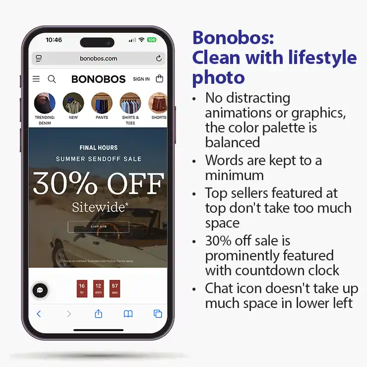
Bonobos: a clean lifestyle look. Click for larger image.
Bonobos is a men’s apparel website.
This home page is clean and displays popular category links at the top. You immediately know there’s a sitewide 30% off sale, and there are no rotating images necessary to let you know that.
Sale countdown clock
The 30% off sale has a clever countdown clock at the bottom of the screen (there is some motion as it counts down, but not much).
Clean, minimalist design
The website uses a white background and a color palette primarily using dark blues and browns. That keeps it clean. There’s a lifestyle image (coincidentally, it’s a car).
There’s a chat icon, but it doesn’t pop up by itself. It doesn’t need to; it’s obvious what it is.
The top of the page is very simple, with a hamburger menu, search function, link to sign in, and a shopping cart icon so you know instantly it’s an eCommerce site.
Bonobos website design turned into an automotive website
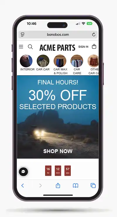
Click to enlarge: Bonobos reimagined as an auto parts site.
Here’s what an automotive parts website could look like, inspired by Bonobos.
(As with McMaster-Carr above, we didn’t change all the photos!)
There is still a 30% off sale, and there is still a lifestyle photo with a truck going off-road at night.
The clean design is still there
The call to action (“SHOP NOW”) is more prominent than it is in the original Bonobos site, but still not too large and definitely not animated.
The color palette remains mostly blue and brown, with a little more gray. Still, it works.
Psychology of color in web design
A quick note on color psychology: blue is often associated with calmness, security, and trust. Brown is a “psychological complementary color” to blue and conveys wisdom and reliability.
Color psychology is a fascinating topic, but it is far beyond this article’s goal. We encourage you to do some searches on it.
The chatbot icon remains in the lower left, but it isn’t intended to pop up automatically. Having a chatbot automatically pop up on the screen is like walking into a retail store and immediately having a sales agent ask if you have any questions.
Good website example #3: Crutchfield
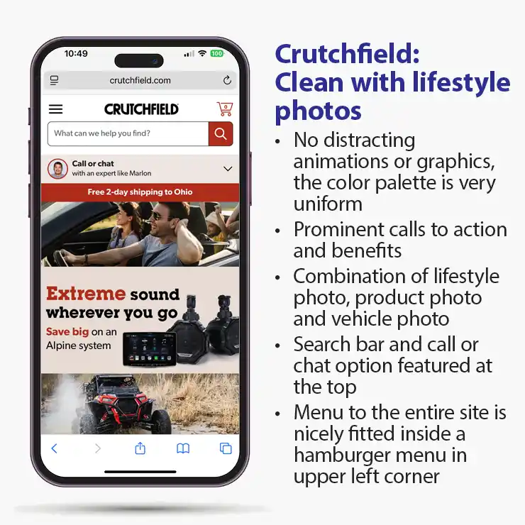
Click to enlarge: Crutchfield has a good looking home page.
For anyone thinking a minimalist design is too sparse, we present Crutchfield. It’s a company that sells electronic products for homes and vehicles. Coincidentally, this example of their home page shows the automotive side of their business.
Although this home page has several photos, it still isn’t busy. It’s clean and well-organized.
It also has a lifestyle photo, a product photo, and a vehicle photo. If you’re undecided on what kind of photo to show on your home page, here’s your solution.
There are a couple of clear benefits visible: “Free 2-day shipping” (to Ohio), and “Save big on an Alpine system.”
There’s no automatic chat pop-up; there’s a “Call or chat” option at the top, which you can choose to use or ignore.
Remember the comments on color psychology with Bonobos? Crutchfield is all-in on brown.
Crutchfield is an automotive site
Done! There’s nothing more to add here; the Crutchfield site is an automotive aftermarket site. It is also well-designed.
Note: this design does not suggest discounting. It does suggest high quality and expertise. If your business model is to promote lowest prices this is probably not your best design choice.
Best website design example #4: Clare
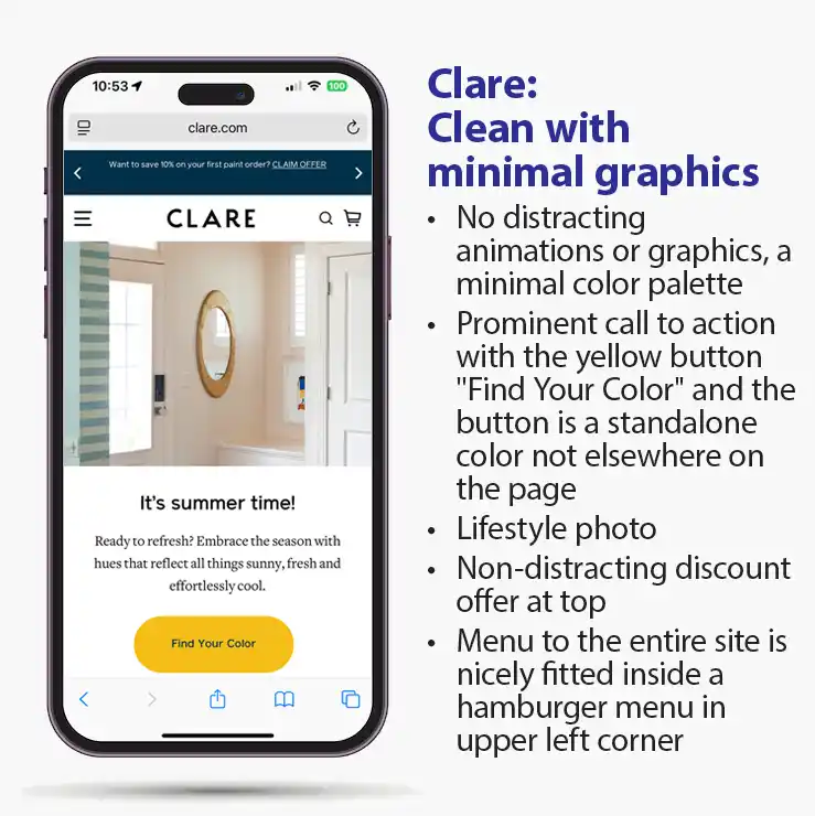 Our last example of good website design is from Clare, a company selling household paint.
This may be too minimalist for a lot of people, but let’s take a look.
As with previous examples, there is no rotating slide show to distract the viewer.
Calls to action
There are two subtle CTAs in the top dark blue banner: “Free shipping on 5+ swatches and orders over $150! SHOP NOW” and “Want to save 10% on your first paint order? CLAIM OFFER.” They do use a somewhat annoying pop-up banner to sign up for emails (not shown here).
Psychology of color: yellow
You can’t miss the “Find Your Color” yellow button call to action. Yellow is attention-getting. And back to the topic of the psychology of color, yellow invokes freshness and new ideas. Perfect for a site selling paint. Or selling automotive appearance accessories.
Clare website turned into an automotive website
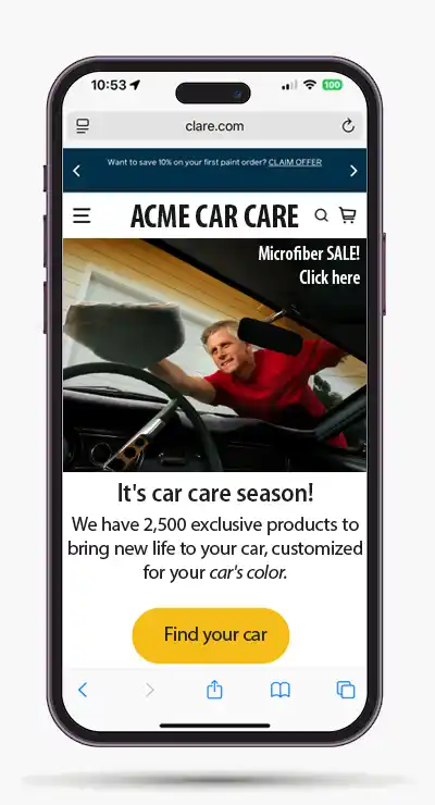
Click to expand: The Clare site design used for a car care website.
Can we turn this into an automotive website? Let’s try.
Here is a fictitious site for Acme Car Care.
Again, no moving slides or pictures (are we repeating ourselves?). The lifestyle hero image is a man detailing his vintage Mustang.
A yellow call to action
The yellow call to action button remains with “Find your car” as the new CTA.
There’s a claim of 2,500 exclusive products matched to your car’s color, but that can be changed to a lot of other things. The main point is to differentiate this website from other sites.
Another call to action, for a sale
There is a sale for microfiber products in the upper right corner of the hero image. It is small and subtle, but could be made larger in the same corner, or it could run along the bottom of the hero image.
Note that, as with the Crutchfield design above, this design doesn’t suggest low prices and discounting.
What do you think? Does this design work for you, or is it too minimalist? Let us know.
Questions to ask a web design company
Below are some starter questions when talking to a web design company about your new website. Ask a lot of questions about how your website should be designed, and how that design would align with your business model. Do you offer low prices vs. high end products and professional advice? Do you have a lot of product categories vs. specializing in a few areas? Do you need to promote occasional sales vs. you carry product line prices that are largely controlled with MAP pricing?
Look through this list of frequently asked questions before talking about website design.
Frequently asked questions about good website design
Q: For the best automotive website design, are rotating banners and slideshows effective?
A: No, rotating banners and slideshows can be distracting and should be avoided on a website’s homepage. Studies repeatedly show that shoppers largely ignore these animations, and they create three major problems: They take up space while being ignored by users, they create too many distractions that confuse shoppers (following Hick’s Law), and they slow down your page loading time due to additional files and code.
Q: What is banner blindness on a web page?
A: Web visitors tend to ignore carousel photos and slide shows. This is called banner blindness.
Q: How quickly can visitors judge an automotive website’s visual appeal?
A: Research shows that web visitors can judge a website’s visual appeal in just 1/20th of a second. Your home page needs to make an excellent first impression immediately. Focus on creating a clean, uncluttered design that loads quickly to capture visitors’ attention right away.
Q: Should I prioritize mobile or desktop design for my automotive parts website?
A: Always prioritize mobile design first. Between 70-80% of visitors to automotive parts and accessories websites are using mobile devices. If your website doesn’t render well on mobile, you’re potentially losing the majority of your potential customers before they even see what you offer.
Q: What is a call to action (CTA) and why do I need one on a website?
A: A call to action is a prompt that asks your visitor to take a specific action, like “Shop Now,” “View Sale Items,” or a click-to-call phone button. CTAs are crucial because they guide visitors to your website and encourage them to start shopping more quickly, ultimately leading to better conversion rates.
Q: For the best automotive website design, how can I reduce distractions on my automotive website without making it look boring?
A: To reduce distractions on a website, focus on clean, organized layouts with clear category navigation. Use high-quality lifestyle images, product photos, or vehicle photos, but keep animations to a minimum. Implement subtle sales banners and clear benefit statements (like “Free 2-day shipping”) without overwhelming the visitor with too many choices at once. And boring isn’t a bad thing, either.
Updated September 10, 2025